Wednesday, May 22, 2019

Project 12 - Stop Animation


By: Mia Johnson and Ainsley Law
For our animation we wanted to make trail mix from all the separate ingredients. We went to Westide Market and bought the nuts and the M&M's. We took photos of the food coming out of its packages and then coming together in one cup to make trail mix. We changed angles and made it look like the food was moving on its own. We took around 300 photos and put the in iMovie where we then edited them into a video. We used iMovie for the music and the text.

Tuesday, May 14, 2019

Magazine Mockup


Our magazine is a fake cooking magazine. We went to the culinary arts class at Lincoln and took photos of the food they were making and the materials in the kitchen. We wanted all our ads to relate to cooking and for the spreads to describing how to cook certain dishes and what materials we like. I did 2 ads and a spread. My first ad was an apple one in which I photo shopped my friend into a white background and used their phrase, "think differently" and turned it into, "cook differently". I also did the Kroger ad where I photo shopped chestnuts into a black background. My spread is the bright blue one and I described and showed pictures of our favorite cooking supplies.

Tuesday, April 30, 2019

Inspiring Stop Animation

https://www.youtube.com/watch?v=pdW9HeqV420

This video is called, "Save the Trees," and it is posted by Suraj Dighe. I it because it is very simple but also has a powerful message. I think it is important to spread awareness about environmental issues and I like that this video spread that message.

https://www.youtube.com/watch?v=QwD0PQ69lPw
This video is called, "Paper Cut," and it is posted by Anson Hou. I like the concept in this one and I thought that it was intriguing. The most interesting part to me was the zooms in and out. I thought it looked really cool the way they zoomed in and it was interesting to look at.

https://www.youtube.com/watch?v=I9k97zpz4Hw
This video is called, "Make a face," and is by a youtube channel called TheClayThings. I think this video is the most advanced out of all them. It look more like actual animation. I liked this one a lot because I think it looks really cool and I thought it was the most entertaining one.

Friday, April 5, 2019

Inspiring Magazine Desings

Covers:
Gray Mountains Travel Magazine Cover


50 Design Techniques That Made These Magazine Covers Awesome [Epic Case Studies] – Design School


Spreads:
PPT design inspiration


Ads:


cool Celebrating 50 Years in Brazil «  F/Nazca Saatchi & Saatchi

These photos are inspiring to me because of the color and vibrance that catches my eye. I think they all have something special at them that catches my attention and I want to recreate something like it. They are too overcrowded with text or photos which at time can make photos look chaotic and overwhelming.

Project 10# - Portrait Photography

I took this photo of my friend when we were on the mountain skiing. She posed with her snow gear and is advertising it. It is a commercial portrait because my friend bought all her snow gear from the same brand and this is advertising that brand.

This is a staff member at Lincoln and she works in the school's student store. I had her pose with the pom poms, a rain jacket, and a beanie. It is a commercial portrait because she has advertising the lincoln brand and their student store.

This is a photo of my older sister when we were in Hawaii. I wanted her to look to the side with the wind in her hair and her looking towards the water. It is a fine art because because the photo is not supporting a company or brand and it is my art direction and decisions for her pose.

This is a photo of my friend Sophie when we were at the Rose Gardens. It is a fine art because I told her how to pose and I wanted it to be serious and more interpretive. 

Friday, March 15, 2019

Surrealism Final - Project 9

I made this image because I found this photo of the road and though it would be cool to enlarge usually smaller objects and put them next to the cars. So I cut a fire hydrant and mailbox so it look like giant versions on the highway/

I found this photo that I took awhile ago of the inside of a UPS truck. I also found two photos of a cab and a tall building. I thought it would be funny to make the cab big and have is basically driving the vehicle. So its like a car driving a car. Then I cut down this photo of the building and put in in the car to make it more unrealistic and surreal.


Wednesday, March 13, 2019

Fine Art Vs Commercial Portraits

Image result for jennifer lawrence portraits
Fine Art
Image result for jennifer lawrence in commercials
Commercial Photography
Taken by Marie Claire

Although these photos are both taken of Jennifer Lawrence, they have very different meanings to them. The first one is a simple photo of Jennifer in black and white. It is just of her face and there is no other meaning to it. The second one is very different. It is saturated and pink and looks like something I would see on a billboard. It pops out way more than the other photo. It is selling lipstick. I think the two photos both have very different reasons for being taken and they both show drastically different sides to the model. One is very bright and colorful and one is duller and more simplistic.

Commercial Portraits

Definition of commercial portraits: Taking a photo for it's commercial use like business and sales. It is taken for money and it is often associated with advertisements.
Image result for commercial portraits
Travis Duncan
I like this photo because of the landscape in the background. I really like looking at photos of snow and I think they way the sun reflects on the ground is really pretty. It caught my eye for the quality and how saturated and in focus everything is which I really like. I think it is a ad for either a snowboard company or a company that sells snow or outdoor gear.

Image result for commercial portraits
Jon Mold
I lik the contrast in this photo and the value. I think it's cool the way the smoke looks against the black and it is interesting to look at. I think this is probably an advertisement for something to do with a men's product. I would assume it would be men's cologne, deodorant, or body spray.

Fine Art Photos

Fine Art Potrait: The photo has no deep meaning to it that is universally known as it's one meaning. It is the creative vision of the camerman. It can represent reality or events.
Image result for fine art portraits
Danielle van Zadelghoff
I like this photo because it can be interpreted in so many ways. It is pretty simple but it also has a lot of interesting things going on. I think it could mean that the girl is somehow restricted from seeing. Maybe she is blind or maybe she can't see things for the way they are and so she has that restricted sense about things

Image result for fine art portraits
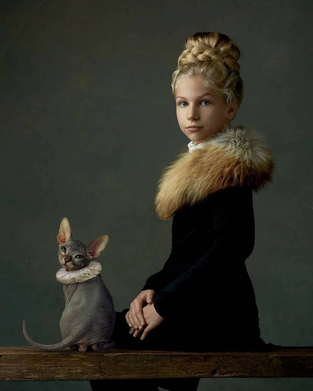
Gemmy Woud-Binnendijk
I think this photo because of the contrasting colors of black to the background. I also like the way the girl and the cat are both looking back at the camera. I think it's cute how the girl and cat both have a furry material around their necks/shoulders and I think it could mean the connection between the person and the animal


Friday, March 1, 2019

Surrealism and Photomontage Pre-Work

Image result for salvador dali surrealism
Salvador Dali


Surrealism: Combinations of unlikely recognizably realistic images. It combines dreams with real life. Unnatural and irrational.

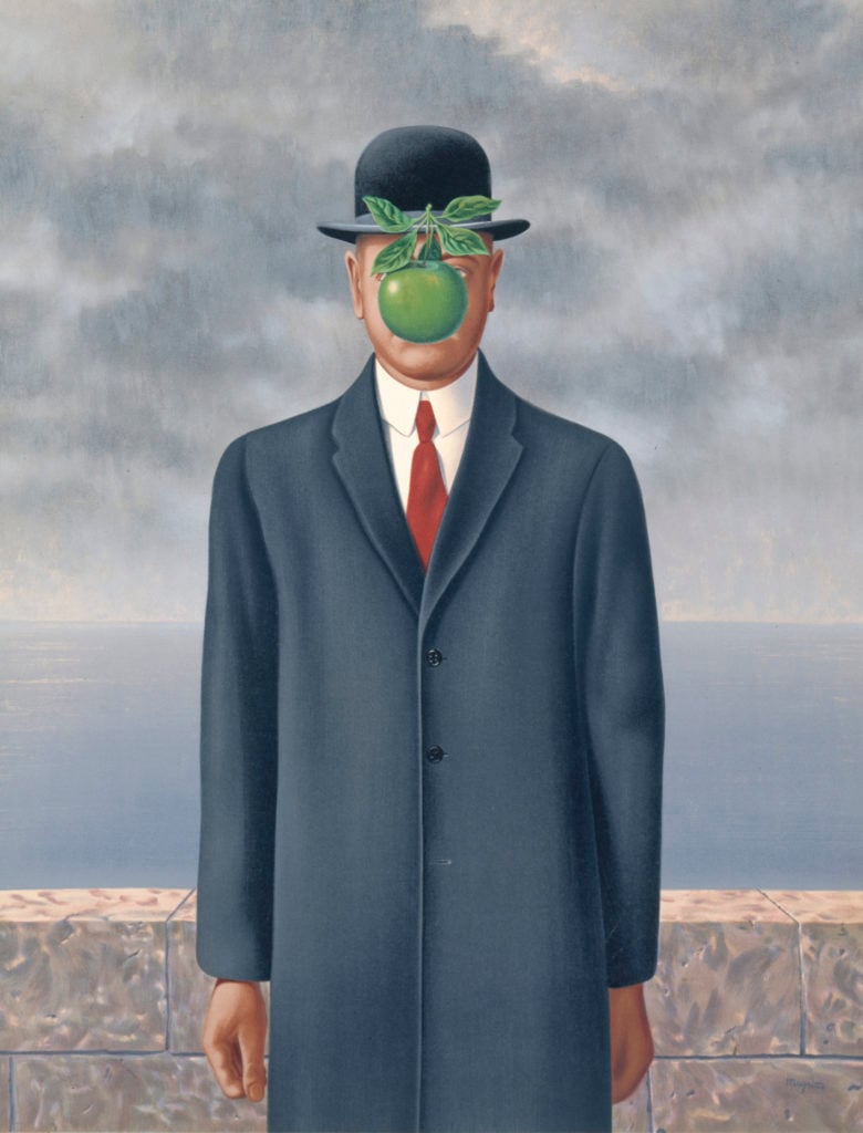
Image result for rene magritte surrealism
Rene Magritte


Image result for surrealism photography
David Heger: This photo is of a rainy afternoon. However, it is a little unique. David uses watering can as what is making it rain. It is surrealism because it is clearly impossible and couldn't literally happen. But it is interesting to see these kind of perspectives and how David and other artists use objects tin an unrealistic situation to show an idea.

Image result for surrealism photography
Platon Yurich: This photography does a lot of surrealism. This photo is beautiful on its own and the surrealism just adds to it. The balloons are showing that the boy is being held up by it. He is flying into the stars and the contrast between the sky and the balloons adds to the detail of surrealism in the photo

Project - 8 Digital Alternative Process


For this project I recreated processes of editing photos that are used but I did them digitally. I did them on Photoshop and I did Daguerreotypes, Cyanotypes, and Gum Bichromate. Daguerreotypes have a warm orange brown look to them. They look older because of the grain added. A picture is made on a silver surface sensitized with iodine and it developed by exposure to mercury vapor. Cyanotypes have a blue tint and they have the soft edges were I used brushes to fill the photo in on a white background. For the real process, you would mix chemicals and water and coat it on a material. Then you use a UV light to get the final product. Gum Bichromate was really fun to make. I did the same thing as Cyanotype but added different colors like warms and cools. You use different chemicals and layer different pictures over it. It has those soft edges and white background like Cyanotypes.


Daguerreotype 

Cyanotypes

Gum Bichromate